Continuing to improve on a previous comic strip

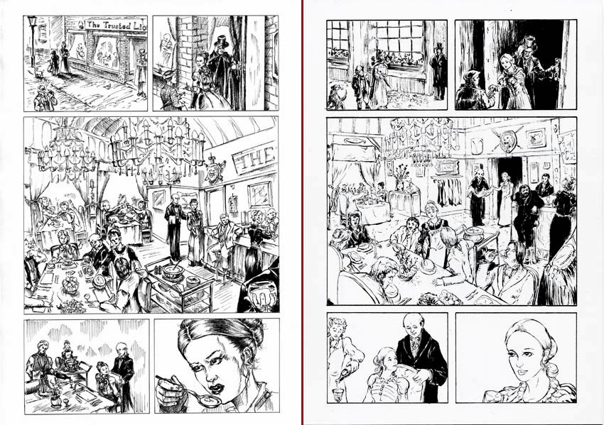
On the New page:
Panel 1 the villain looks less intimidating and the angle creates a sense of movement like he's swanning over to the heroine. There's also more space for his dialogue.
Panel 2 is much the same as before but zooming in creates I think more intimacy and again the space allows for more dialogue
With Panel 3 I started to make more considered changes. I felt it was important to see the faces of both characters as they converse and I swapped them around as she speaks first in the script. The background I ditched but added some odd outlines of other diners, this I felt de-clutters the scene but still keeps a sense of where they are.
Another major change is Panel 4, which was originally 2 panels. Merging them into a single panel brings more emphasis to the drama. As a single separate panel the action seems displaced but in the merged version, action is taking place behind the unsuspecting villain, creating a sense of conflict as each vies for the heroine's attention.
The 5th panel is similar to before but the heroine faces into the page instead of out. Having her look in connects her to the previous panel. Also keeping the face closely framed emphasises the dilemma she is presented with.
The last Panel is much the same though again less cluttered.