Thursday 10 November 2016

Monkfish

It's been a while since my last post, I've been very busy with various work.

 I recently entered my work, Monkfish, at  Thought bubble , the Leeds comic book festival and, unexpectedly, I came second. I wasn't planning to go but they informed me that I could have a weekend pass and there were prizes :)

Due to it being an unexpected trip I rushed to get a sample ready for another competition but alas missed the entry time for that one. It was a good experience though and I met a few people and, fingers cross, some work will come from it.

Regardless of that I got some good feedback regarding my portfolio. There's still things to improve on but I'm definitely headed in the right direction.

 Monkfish is watercolour over ink and my portfolio consisted of this, The frog who lost her hop and Innocence abroad  and a black and white piece I'll put up next time.  The watercolour pieces were very well received and all comments were positive.... so fingers cross. I think I'm definitely sticking with water colouring as opposed to digital colouring.


Saturday 9 July 2016

Elizabeth part 2


 Following on from the previous post this is the finished portrait.

I didn't want to spend too long on this painting so kept the composition very simple.

Without having to consider other elements such as limbs, torso, background, foreground, what she's doing and so on, really frees up getting stuck into the process of painting.  To the point it felt like a leisurely painting exercise.

In the end it took about 5 short sessions, spread over two weeks, to finish. This way I could fit it in between doing other things.


Friday 1 July 2016

Elizabeth

"Uncle Norman...?"

"... Yes, Elizabeth?"

"Could you paint a picture of me... for my birthday...?"

"...uh  yeah, sure  :)"

Not quite finished yet, but... hopefully over the weekend.

Tuesday 1 March 2016

Cycle of Violence Submission part 2

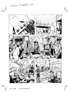
This is the final inked artwork for cycle of violence with a very few tweaks here and there from the original pencils. Most notably I added a ceiling and sky lights in page 2 panel 2 to give the impression that the character is inside an indoor training complex and also widened that panel for dialogue. Also, on the last panel of the last page I trimmed the image so it doesn't bleed off the page


Looking back at it now after a couple of weeks away from it, I can take some pros and cons regarding the work.
 I'm happy with the layouts of the images and the flow of the sequences... maybe could do with more over head shots such as page 5 panel 1. 
I felt I really got into the story, but in doing so I didn't keep strictly to the descriptions for the script ( I don't know if that's a good thing or bad. I think I'll put up the pages with the text on my next entry. That'll give me another point of view regarding the strength of this piece).
 
I think my pencils from before could probably be a bit cleaner and defined and like wise my inks as shown above are a bit on the rough side, more solid blacks should be used and cleaner lines in certain areas.
Looking at the work on screen and shrunken down, the cleanness and contrast of page 4, panel 3 and possibly page2, panel 1 stick out to me as a positive, the other panels look very cluttered and less defined, a bit overworked by lines.   
Anyway I'll have to wait for the feed back. The samples have been sent.... so fingers crossed. 

Thursday 11 February 2016

Cycle of violence submission part 1.

This is the pencils for my next 2000AD submission, based on their sample script "Cycle of Violence"

The work was done in my spare time, spread over about 3 weeks since I got back from Thought Bubble.
 With this sample I took some liberties with this script and didn't follow the descriptions too strictly but the original narrative should still fit with what I've done. 

I had previously roughed out the pages following the descriptions and panels closely but felt the images were disjointed and didn't really connect from one panel to another which is something Tom Foster said about my competition entry at Thought bubble. Whereas in thought bubble it was my own choice of images, this time I felt it might be the descriptions of the images.

So with that in mind my approach was to first, break this story down and for me it fell into 3 parts.
Chapter 1 starts in the middle of a crime and finishes with the main character( the boy) surviving the event.
Chapter 2, the boy enrols, graduates and establishes himself as a Judge.
Chapter 3, he encounters the crime that breaks him and ultimately leads to his death at the hands of his former saviour.

Second I read through each chapter and tried my best to edit the written descriptive sequence to fit what I thought would make a better visual sequence.

Notable changes is that I fit the whole of chapter one into the first page and condensed the first 3 and a half panels into the starting image (below), allowing for dialogue and title.


In chapter 2, first page (below left), panel 2, I wanted show what was in the narrative that the boy physically excels though he's a loner.  Panel 4, he's not contemplating his revenge in bed but straight after getting his head flushed in the loo in panel 3.  Panel 5, instead of already having laid out one of the bullies I thought his approaching them would contrast nicely with panel 6. Second page (below right), panel 1 he's walking away from a disciplinary with a sneer and the beaten bullies can be seen in the background.

Chapter 3 I did a lot of changes here. The written descriptive goes as follows: 1.found dead body, 2.mug shot, 3. interrogation (though the narrative is about the suspect going free), 4.the young Judge isn't happy, 5. suspect is followed, 6. picture of the city looking vast.
My visual sequence(above) is 1, found dead body.  2. young Judge arrests suspect. 3. suspect goes free and young Judge looks on not happy.  4. he follows suspect.  5. young Judge's attention is diverted to another victim of crime and can only watch the suspect walk away.
And on the middle panels of the last page he turns away and sees his reflection. I couldn't figure how to do that with one panel so split that into 2.
 
The original script can be down loaded from the 2000AD site.
 
Since finishing this entry I've now finished the inks and that will be part 2 of this when I get the time to blog it.


Sunday 17 January 2016

Paintings of cafes

 
While working on new comic book samples I was approached to contribute some paintings for a book by likenesspress.

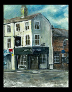
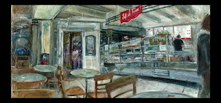
The work consisted of interior and exterior paintings of 2 local oxford cafes. I wanted it to resemble the style of a previous painting but needed to economise the process. I think it's worked out pretty well.
 
I spent about 3 hours at each location sketching from observation up and taking photos for reference.
 
After priming and preparing the boards for painting I spent about a day of work on each painting spread over 2 days for drying time at certain stages. This allowed me to switch my attention from one painting to another while leaving the  one I just worked on to dry.
 
All in all that's not too bad, including the preliminary work that's just over 5 days of work.


Joe Perks & Co in St Clements, Oxford
Exterior (above left) and Interior (left)


Sofi de France in the Covered Market, Oxford
Exterior (left) and Interior (below)